YouTube Music Redesign Is Here, and Your “Now Playing” Screen Gets a Massive Upgrade
The long wait for a cleaner, more modern YouTube Music experience is finally ending. Google has officially started the wide rollout of a brand-new split-view redesign for your “Now Playing” screen.
If you have felt that the app was getting a bit cluttered lately, this update is exactly what you have been looking for.
What Is New in the YouTube Music Redesign?
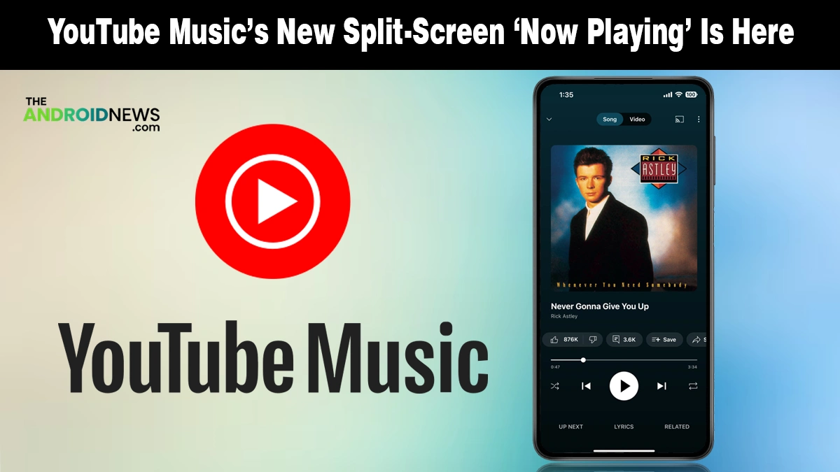
As Android Authority notes, the most visible change lands right at the top of your screen, where the bulky “Song/Video” text toggle has been replaced by sleek, minimalist icons. This small tweak clears up valuable space and gives the player a much more sophisticated look on your Android phone.
Here is exactly what you will notice when the update hits your device:
- Dual-Pane Layout: Your cover art now sits prominently above a new, dedicated space for your queue.
- Thicker Progress Bar: The playback line is now more substantial and intuitively expands when you tap it to scrub through a track.
- Swipeable Queue: You can now swipe up anywhere on the player to reveal your “Up Next” list in a half-screen view.
- Relocated Lyrics: The dedicated bottom tab is gone; you will now find your lyrics sitting right next to the thumbs-up and thumbs-down buttons.
- Hidden “Related” Section: Recommended tracks and similar artists are now tucked behind the song title for a cleaner interface.
This redesign drops the tab-heavy layout and feels more natural. The controls stay familiar, but everything looks cleaner and more balanced.
Why This UI Shift Is a Major Win for You
Google has been tweaking this layout in limited testing for months, and the final result feels like a true Material 3 refinement, just as seen in the recent Google Wallet redesign. It is not just about looks; it is about how you actually use the app while on the move or during your workout.
This update effectively turns your player into a more powerful dashboard. Having your queue instantly accessible without leaving the main screen makes managing your listening session much faster.
How to Get the New Look Right Now
The update is reaching users globally, but it is rolling out in waves. To check if you have it, open your app and look at the “Song/Video” toggle at the top. If you see icons instead of text, you are on the new version.
If you are still seeing the old layout, ensure your app is updated to at least version 9.14. Since this is a server-side switch, your best bet is to wait a day or two for Google to activate it for your account.
This rollout follows the pattern of previous Android Beta Program updates, where stability is prioritized over a sudden global blast.
Source: YouTube Music rolls out split view Now Playing redesign