Google Wallet Just Got a Long-Overdue Redesign And It Is Finally Rolling Out
Google Wallet is getting a complete visual and functional overhaul, and after months of testing behind closed doors, the redesign is officially rolling out to Android users today.
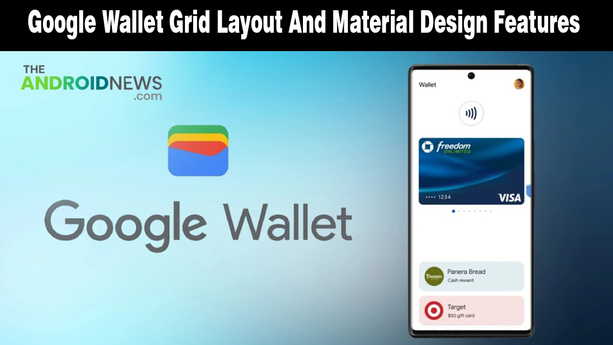
The update, arriving with version 26.14.895964528, replaces the old scrolling list layout with a smarter, grid-based home screen built around the passes and cards you actually use every day. It is a change that Google Wallet users have genuinely needed for a long time.
What Is New in the Google Wallet Redesign?
The update touches both the home screen layout and the individual card and pass interfaces. Here is everything that changes when the new version lands on your device:
- Grid layout replaces the list view: The home screen now displays passes in a two-column grid instead of the old single scrolling list, letting you see more at a glance
- Star your favorites: A new star icon on each card lets you mark up to four passes as favorites
- Drag and drop reordering: You can physically drag and drop your starred passes to arrange them in whatever order makes sense for your daily routine
- “View More” button: Non-starred passes are tucked behind a new View More button at the bottom of the home screen
- Search bar on the full passes screen: When you tap View More, a search bar appears alongside options to sort all your passes alphabetically or by most recently added
- “Manage passes on home” control: A dedicated management screen lets you add, remove, or reorder which passes appear on your home screen without digging through settings
- Refreshed individual pass design: Each card now gives more visual prominence to the pass graphic itself, while key details like your ID number and barcode are surfaced directly on screen without extra taps.
Why This Update Matters for You
The new grid and drag-and-drop reordering streamline high-traffic moments at transit gates and checkouts, placing your most-used passes just one tap away.
Organizing payments in Google Wallet seamlessly aligns with Android privacy practices and trusted third-party security apps, ensuring your digital identity remains as protected as it is accessible.
The redesign is also the latest expression of the Material 3 Expressive design language rolling out across Google’s Android apps, a visual system that has been steadily reshaping how Android OS updates look and feel across the entire platform this year.
How to Get the New Google Wallet Design
The redesign is a server-side rollout, which means you do not need to manually download a new version.
Update Google Wallet to its latest version from the Play Store, then force stop the app and reopen it. If the new grid layout does not appear immediately, give it a few hours; Google is rolling this out gradually, and not every device will see it at the same time.
Note that the more colorful pass UI spotted in earlier testing has not yet been included in this rollout. Google is still finalizing that layer of the redesign, and it is expected to follow in a future update.
Google Wallet Finally Feels Like It Was Built for Daily Use
The old list layout was functional, but never felt designed for the way most people actually use a digital wallet.
The new grid, favorites system, and cleaner pass views change that. This is a proper redesign, one that makes Google Wallet noticeably faster and easier to use in the real world, not just on a spec sheet.
Source: I tried the redesigned Google Wallet app, and it fixes my 2 biggest complaints